
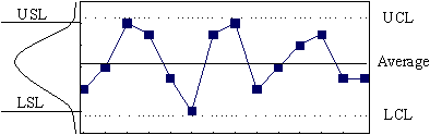
A statistical Process Control Chart (SPC) is simply a run chart with statistically determined upper (Upper Control Limit) and lower (Lower Control Limit) lines drawn on either side of the process average. It is used to determine how much variability in a process is due to random variation and how much is due to unique events/individual actions so that you know whether or not the process is in statistical control.
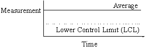
In this case the process is in control but is not within an acceptable range. The curve to the left of the SPC shows that the acceptable range limits are narrower than the control charted process. Either you improve the process or change your acceptable range. Just remember that an acceptable range is what you think you need and control limits are what the process can do consistently.
The pattern of control charts can show trends, shifts and cycles in the process being measured ("out of control" patterns):
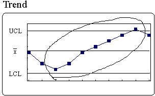
There is a continued rise or fall in a series of points (7 or more consecutive points in the same direction). A trend often occurs after a change has been made to the process. This pattern can indicate if the change had a positive or negative effect.
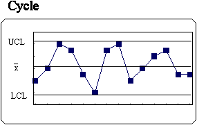
When the points show the same pattern of change over equal periods of time, the process is considered cyclical. Knowing and understanding the cycles of a process help in making staffing decisions.
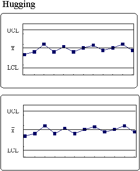
Points stay close to the center line or control limit line (2 out of 3, 3 out of 7, or 4 out of 10). This pattern suggests that the data is grouped incorrectly. Hugging the center line does not indicate a controlled process. It indicates a different type of data has been mixed into the sample, distorting the average (mean) of the process. The data needs to be regrouped into more appropriate categories, then charted on a new control chart.
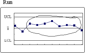
Points occur continually on one side of the center line. The number of points in a run is called the "length of the run." A run suggests the process has undergone a permanent change and is now becoming stable.
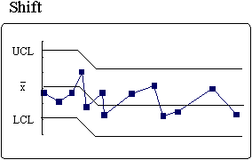
A shift occurs when the mean of the process goes up or down. A permanent change in the process has occurred. Control lines should be recomputed for future interpretation.
(click on the image to take you home)