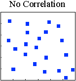

A scatter diagram is a plot of one variable vs. another to see if there is any relationship between the two (e.g. stakeholder wait time and time of day). Different factors can affect process and the people doing the work. Often, the combination of two factors can have a positive or negative effect on the process.

There is no apparent relationship between the two variables. The team should consider looking at a different set of variables.
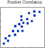
There is a defined, predictable relationship between the two variables. An increase in one variable is accompanied by a predictable increase in the other variable (e.g. time of day and stakeholder wait time).
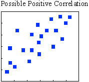
A defined relationship between the two variables may be present. An increase in one variable may cause an increase in the other variable, but other factors may also be involved. Additional testing may be required.
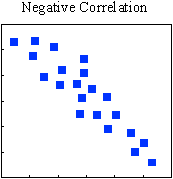
There is a defined, predictable relationship between the two variables. Each increase in one variable is accompanied by a predictable decrease in the other variable (e.g. quality and stakeholder complaints).
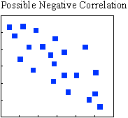
A defined relationship between the two variables may be present. An increase in one variable may cause a decrease in the other variable, but other factors may also be involved. Additional testing may be required.
(click on the image to take you home)