Pareto Chart

Purpose

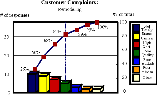
To help set priorities among a number of problems or a number of causes by arranging data graphically in descending order of frequency.

Guidelines

Construct a Pareto Chart in the following manner:

  1. Separate the collected data into categories, i.e. common themes. In the case of the stakeholder interviews, list by subject or type of complaint. Other data can be categorized by shift, department or type of error.
  2. Calculate the number of complaints in each category as well as the percentage of the total. You can create an "other" or "miscellaneous" category for the lowest numbered complaints.
  3. Draw the bottom axis and list categories in descending order (largest to smallest).
  4. Draw a vertical axis on the left side and number it, starting at zero and ending at the sum of the responses of all of the categories.
  5. Draw bars for each category, each as long as the number of responses in that category.

    Below is an example of the above construction of steps 1-5 of a Pareto Chart.


  6. On a vertical axis on the right side, write 100% across from the sum of all of the responses and mark some intermediate percentages, e.g. 25%, 50%, 75%. Place the cumulative percentage of the total for each category above its bar and next to a dot refernced to the vertical axis (0% to 100%). For example, if the first bar is 26% of total complaints, and the second is 24% of total complaints, the dot for the second bar will be at 50%. Connect the dots with a curved line.

    Next, draw a vertical line at roughly 80% (see below). This line indicates, according to the Pareto Principle that categories Not Timely, Status Unclear, High Cost, and Poor Quality account for about 80% of all stakeholder complaints. If the team puts its efforts into these categories, they will get the greatest return for their effort.

  7. Title the graph and list the date of completion or time period.


    (click on the image to take you home)